Sobeys + Scene Loyalty
Integrating a loyalty program driven complex digital grocery revamp
Overview
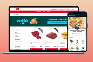
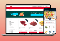
Sobeys Inc. is a Canadian supermarket chain operating under a variety of grocery banners. Given the ever-evolving realm of modern digital retailing and customer loyalty, Sobeys needed a digital revamp in the form of a personalized loyalty program integration across its empire brand and sub-brands. They engaged our design and development team at Deloitte to revamp their iOS and Android native apps, alongside responsive websites to align with the launch of a new points program in partnership with Scene. Their endeavour was compounded by the goal of executing a simultaneous launch across all eight banners, totalling 16 native apps and 8 responsive websites.
At the heart of this mega-initiative lay one of Sobeys' core objectives - to help Canadian families save time and money by making grocery shopping feel personalized and rewarding. A robust multi-phase approach was identified to drive this initiative, of which my design team and I engaged in the design discovery, concept creation, design delivery & launch stages. We had inherited a body of research from earlier discovery phases which required further synthesis. This helped us prioritize user needs in need of most attention and set the foundations right.
Objective

My Role
Stepping into the role of the Lead UX on the project, I assumed the responsibility of overseeing and organising the design collaboration beteween our design team of two UX designers, two UI designers and a creative lead. Additionally, I worked closely with a Senior project manager, a Functional lead and the development team to facilitate the delivery of an extensive catalogue of design artefacts through the different stages of design discovery, implementation and handoff. Following are the specific responsibilities I assumed on the project:
Lead design presentations, conveyed revisions & facilitated white-boarding sessions with stakeholders and cross-functional teams.
Guided the research synthesis to enhance the overall IA & design with relevant incremental improvements every step of the way.
Planned and authored usability testing scripts to identify gaps between current and future states of customer journeys.
Co-authored new design components as a part of a multi-tiered design system. These components allowed us to iterate rapidly and facilitate scalability across our design process.
Guided junior designers' concept iterations and screen flows, ensuring compliance with UX best practices across wireframes of all fidelities.
Collaborated with the cross -functional teams to prioritize features & functionalities based on MVP relevance, desirability, complexity, and overall story points.


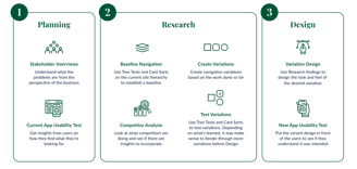
The Design Process
Prioritizing a human-centered
approach to design discovery & ideation
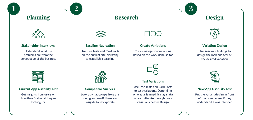
The design discovery and delivery phases of the project spanned a total of 28 weeks. We kicked off a 4-week Sprint 0 by immersing ourselves in the client's business requirements gathered through a usability intake that we organized a few weeks earlier.
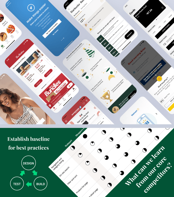
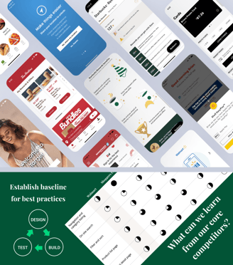
We conducted a competitive analysis between both direct & indirect competitors and presented a UX POV based on findings.
Additionally, time spent on observing UX trends & best practices within the food retail and distribution industry was used to study how loyalty programs enhanced customers' purchasing habits and task completion patterns.
We refined the overall app hierarchy with insights gained through usability testing the current banner apps and running card-sorting tests with small groups of users. This helped us validate and enhance our proposed information architecture within the context of newly integrated loyalty-driven features.
Insights were gathered through qualitative research and user testing concepts with a small group of app users. This helped us identify and prioritize areas of improvement to address during our future design sprints.
How might we help Canadian families save time and money by making grocery shopping feel personalized and rewarding?
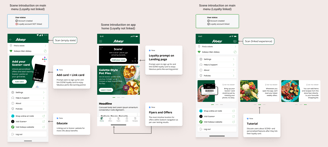
To illustrate the essence of our design process through a few broad brush strokes, below are some areas of investigation our team focused on while user testing initial wireframes. This was done to test and validate the broader experience architecture our client prioritized for the banner apps.
A Peek At The Details

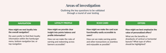
Navigation
Key Insight
A simplified, accessible navigation helps user discover where loyalty lives and how it relates to more perks.
While user testing the current banner apps, we noted that user found the existing navigation to be disorienting and unnecessarily complex. This was reflected in the way they struggled to find key functionalities. We prioritized simplifying and restructuring the overall IA with a concurrent introduction to and integration of SCENE.


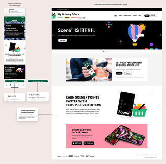
Understanding where loyalty and personalised offers live within the new app was of paramount importance to the business. To weave the loyalty story consistently across the whole app experience, we visualised a customer journey that maps all the potential levels at which SCENE and related perks would be unveiled.
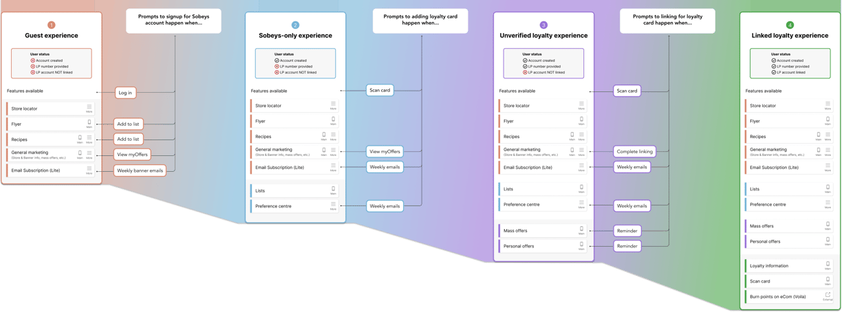

We strategically introduced SCENE in areas across the app's unauthenticated and authenticated experience such as menu, sub-menus, mass offers, landing and onboarding screens. We did the same exercise for multiple banner apps under Sobeys with contextual tweaks relevant to each one's current offerings.
Customer Journey
While the universal hamburger navigation helped communicate how loyalty nested into other offerings, the bottom dynamic navigation was the most intuitive option for housing personalized offers of all the variations tested.
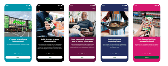
Introduction to SCENE + on various app sections


Loyalty Profile
Key Insight
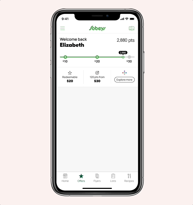
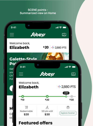
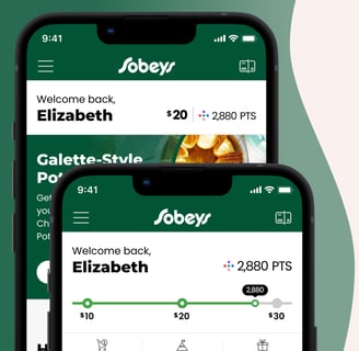
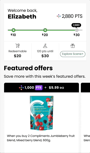
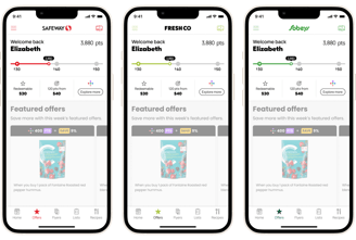
A clear visual emphasis on dollar value conversion of loyalty points were top priorities for users.
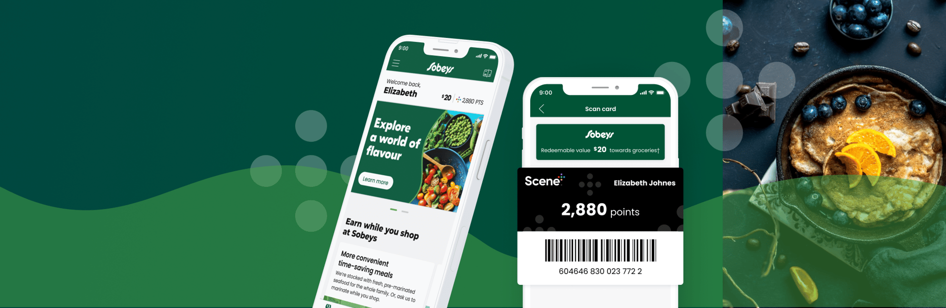
Above and beyond points balance, seeing the dollar value conversion of their SCENE points was a high priority for many users. The visual of the tracker also incentivised users to want to reach the next reward and was seen as the higher priority anchored to the top of offers and home tab.
We designed the points component while keeping several business and design constraints in mind. For example, we had to set a lower bound limit to text fields like user name and points total to 200 px and 112 px respectively so that the font size reduces to a minimum of 16 pt to accommodate maximum characters while preserving legibility. The business had also set a points redemption limit of 500$, which had to be displayed as a message when users approached that milestone in their loyalty journey. We designed an alternate card view where the component increased in height to accommodate additional messaging.
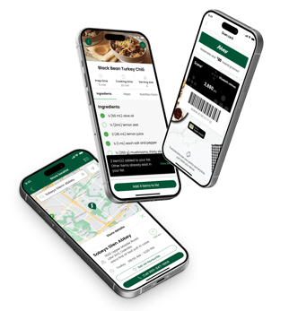
Scan Card
Key Insight
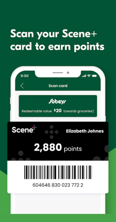
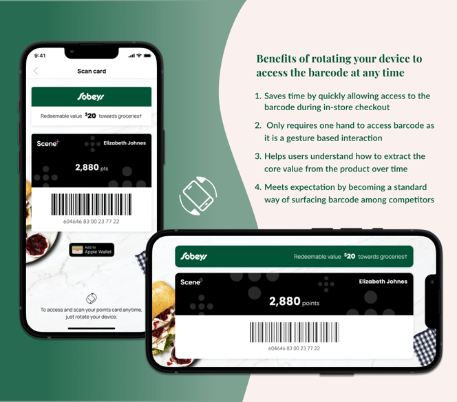
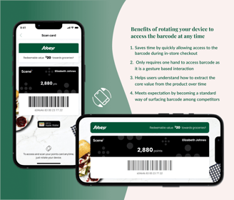
Users want a path of least resistance when accessing loyalty card to earn or redeem points during checkout.
During initial rounds of user testing the barcode scanning feature, we learnt that the amount of steps a user needed to take to pull up the digital loyalty card was one of the biggest deciding factors for how frequently users would use this feature. The more the steps, the less likely were the chances of future engagement.
Based on this insight, we worked with the assumption that enabling and designing a shortcut to the scannable barcode both within and outside the app would indirectly inspire a greater sense of loyalty and stickiness to the program. After testing a few different concepts, we zeroed in on the feature of rotating the mobile device to a landscape position to access the barcode at any time within the app. This would enlarge the barcode size making it easy for scanners to pull up the right loyalty accounts during checkout. Additionally, users could add the SCENE card to their Apple and Android wallets for easy access outside the app.
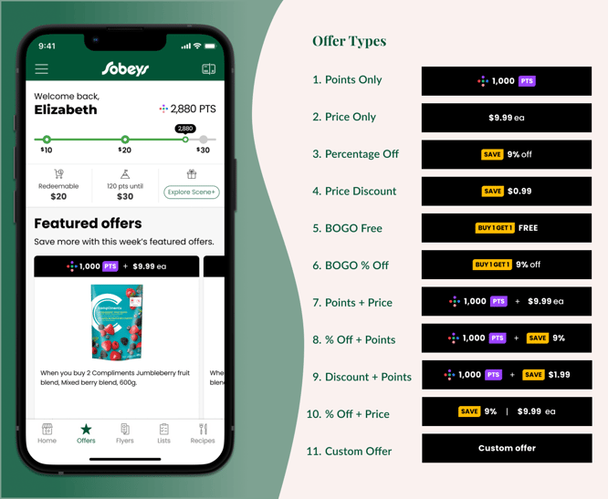
Offers
Key Insight
Simplicity and transparency in offer types & terms is key to communicating intuitive personalization
Users preferred seeing fewer categories of offers with clear copy to indicate how they were personalised. Layout preferences depended on their shopping mindsets: horizontal scrolling with large imagery fostered a sense of discovery, while the vertical layout allowed users a quicker scan through offers.
Additionally, users assumed that they did not need to manually load offers as this was seen a cumbersome step in their point collection journey. They just assumed that they would be automatically loaded as long as they had an account. They thought that signing up to loyalty already implied that they were interested in offers. Once we confirmed that loading offers automatically would not impact offer personalization from a technical perspective. We recommended that the app should have all applicable offers including mass level offers auto-loaded for all authenticated users.
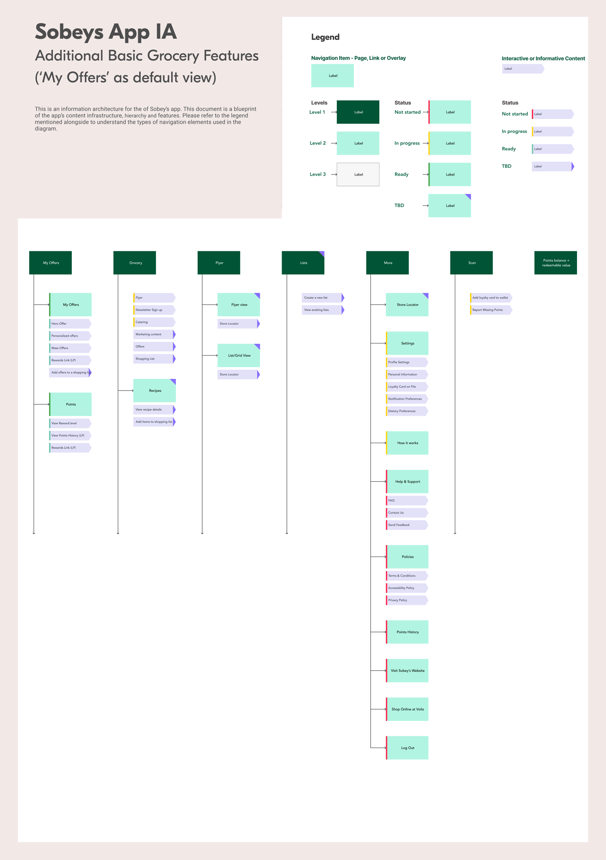
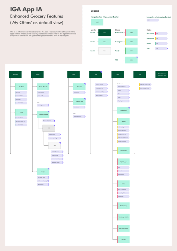
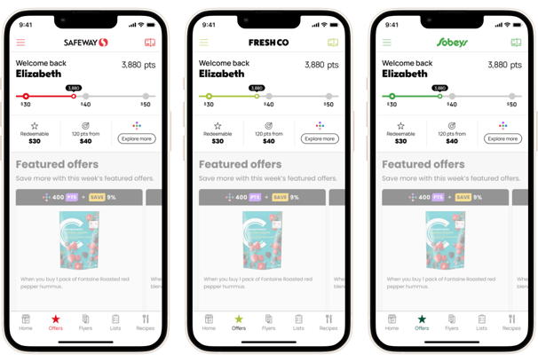
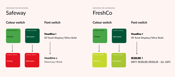
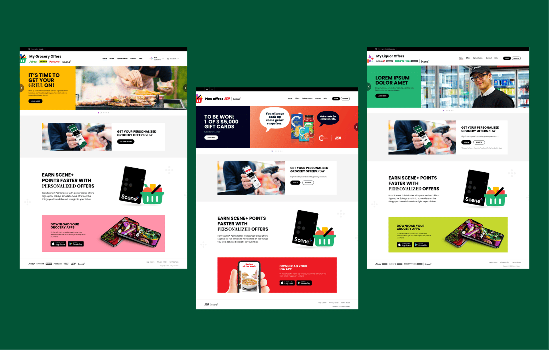
One of the key intriguing challenges that our teams got to tackle on the project was developing a multi-layered design system that needed to support different brands and features across multiple channels and operating systems, while working with a limited schedule and resources. Our team was focused on devising a sophisticated plan to support accuracy and consistency across all 8 banner apps. Recognizing the enormity of the task at hand, we prioritised designing a single white-labeled loyalty experience that would be tested and refined thoroughly before scaling the experience to all other sub-brands under the Sobeys banner.
When our team reviewed small samples of all the sub-brands, we noted that their brand guides had different levels of variability. This meant that the white labelled product could not be scaled easily and seamlessly without some standardisation. To make the best use of the style guides shared with us, we created a multi-tiered design system to support brand differentiation, while keeping the original integrity of the white label experience in tact.
For example, our team decided to scale back and standardize branded elements like navigation, tabs, buttons, product cards, promo cards, ads, and callouts, leaving room for applying a fully branded, banner-specific skin to shine through in the final UI. This approach helped us stay true to the UX design ideation and research work done in earlier stages while simultaneously illustrating how the customer facing experience will be differentiated across banners. We did this strategising for apps as well as key webpages of all the respective sub-brands. This ingenious approach not only streamlined our design process but also left us with extra time to introduce captivating micro-interactions to the designs.
An Interesting Challenge

The results of our efforts were beyond gratifying. In the mid-year of 2022 the new Sobeys app launched with a bang and soared to a stellar 4.2 star rating from its pre-launch 3.6 star rating in the App Store, garnering thousands of downloads and securing a spot in the top 35 of the food and drink category. The satisfaction expressed by both Sobey's and Scene served as a heartening validation of our collaborative approach. Moreover, this project ignited a spark of motivation within our team, setting the stage for future collaborations with Sobeys.
Personally, I was grateful to be put in an empowering position of enabling, building and sustaining trust and transparency among our creative team and the stakeholders . I consistently communicated design and business implications while incorporating and honouring the client's feedback throughout the project lifecycle. This project helped me flex my operational and tactical management muscles, which elevated my overall experience of this complex but exciting design challenge.
Outcome

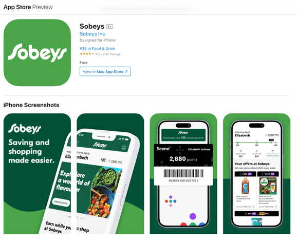


Download the app for yourself

Interac
IGA