IGA
Exploring the future of personalization in the digital grocery market
Overview
In Canada, IGA is a group of independent grocers supplied by Sobeys, operated primarily in Quebec. Unlike the chain store model, most IGA stores operate in small-town markets and belong to families that manage them. In a continued effort to differentiate themselves as local produce market leaders with roots in the community, they wanted to explore and enhance elements of personalization within their customers’ online shopping experience, in turn increasing the customer adoption of their existing website & app. That’s where our design team stepped in to help out.
Discovery Objective
As IGA's design partner, our goal was to study the role personalization plays as a customer loyalty trigger in digital grocery market. We needed to design and test features based on desirability and strategic fit with the brand. To achieve this we :
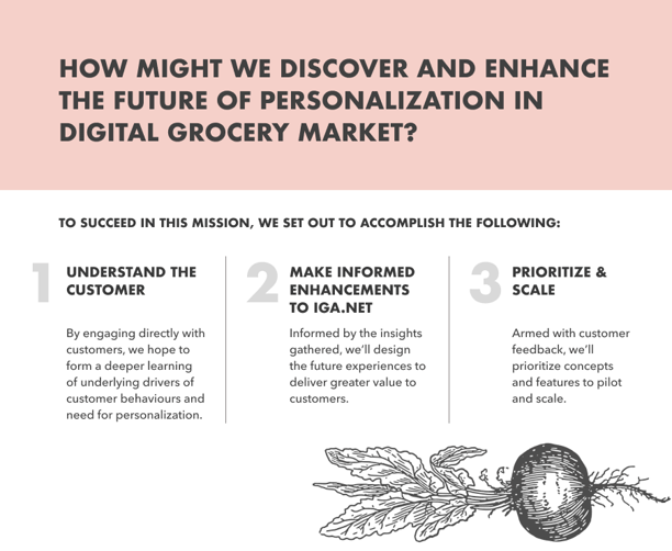
Engaged in deep customer research to explore the subject,
Brainstormed around top-line insights.
Visualized and validated concepts with customers to get a sense of their desirability, and
Prioritized feature sets with the potential to scale website usage
My Role
As a Senior UX Designer and researcher, following are some of the responsibilities I held on this project:
Devised a research strategy in collaboration with the Product manager and UX researcher to identify gaps between current and future states of customer journeys.
Conducted research via interviews, facilitated discovery workshops with stakeholders and oversaw user tests to gather insights about users' motivations, behaviours, and pain points.
Drafted interview scripts with UX researcher and copywriter to guide user testing sessions.
Synthesized research data to identify patterns, trends, and insights that can inform design decisions.
Created user personas based on research findings to represent different user groups and their mindsets, goals, and needs.
Created high fidelity wireframes and prototypes to test incremental design changes and made enhancements to our concepts.
Presented research findings and insights to stakeholders to influence design decisions.
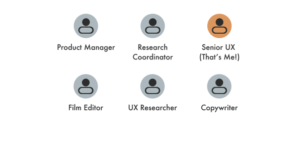

Creative team Structure
How might we discover and enhance the future of personalization in digital grocery market?
The discovery process
We began our research by conducting a market background assessment to understand the current digital grocery landscape and what we must consider before drafting scripts for in-depth customer interviews.
The Business Challenge
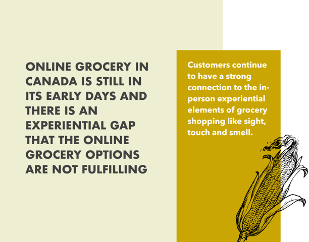
While Canada is moving towards an increasingly digital future, customers continue to have a strong connection to the experiential elements of grocery shopping, which has slowed down the adoption of online offerings. Convenience is no longer a differentiator for today’s customers. They expect things to be quick, efficient and accessible as their preferences are shaped by innovation happening in technology, entertainment and other areas in the retail sector. As digital mindsets mature, the relevance of online retail spaces are renewing and personalization has the potential to fill the gap

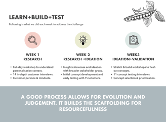
Research+Validation Format
To help IGA respond to this challenge we agreed on a three week sprint format that would allow us to quickly learn, build and test a way forward. Our discovery period (illustrated alongside) was divided into 3 phases, each lasting a week.

Research Overview
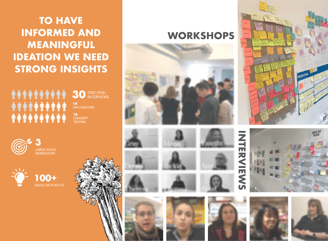
To have informed and meaningful ideation we needed strong insights. To achieve this, we engaged in extensive conversations with key stakeholders and in depth interviews a broad range of customers to understand their gripes and wins with online grocery shopping as broadly or specifically as they wished. They were encouraged to elaborate on their current experience of IGA’s current website and apps & suggest functionalities that could incentivize them to use the platforms more often.

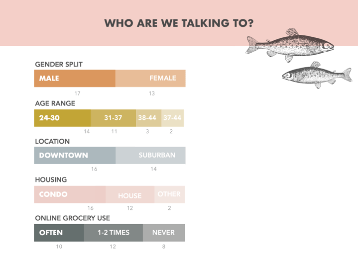
Study Demographics
We screened a total of 30 customers that ranged between 24-47 years old with a nearly equal split between urban vs. suburban dwellers.

Customer Insights
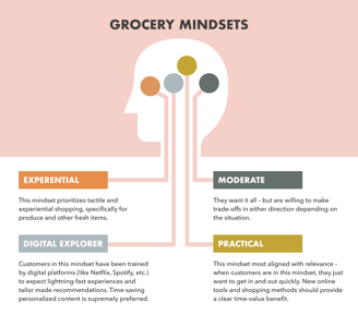
Broader Grocery Mindsets
The people we spoke to fell into 4 overall archetypes. However,
because grocery is such a personal and contextual activity, we found most customers aligned to more than one mindset depending on their situation. We distilled these themes into personas we could keep coming back to for reference during the ideation stage.

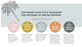
Key Themes
Even though we identified a long list of customer pain points in regards to their current experience of IGA's web & application and the general digital grocery landscape, we distilled this feedback into 5 broad foundational insights to anchor our design process.

Concept Development
Guiding Design Principles
Our 5 foundational insights helped us define a focused set of guiding design principles that drove our initial concept creation and subsequent feature-set prioritization. These principles were coined through both a customer and business lens.


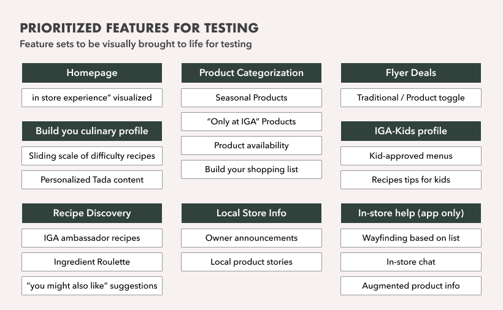
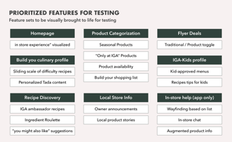
Armed with our foundational insights & design principles, we prioritized key website features to be tested based on the highest potential impact for personalization-driven adoption. We clustered them into feature sets for user testing their value in the customers’ eyes.
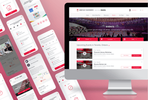
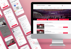
Branded concepts
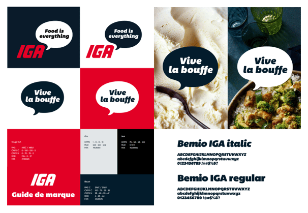
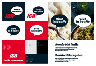
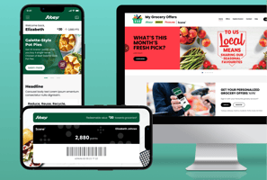
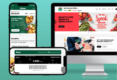
The desirability of feature-sets we wanted to learn more about, was tested via high-fidelity prototyping, accompanying broad interview questions, and verbal aids. The prototypes were designed following IGA brand guidelines and the website’s style guide to remove room for bias.
Test Participants & Assumptions
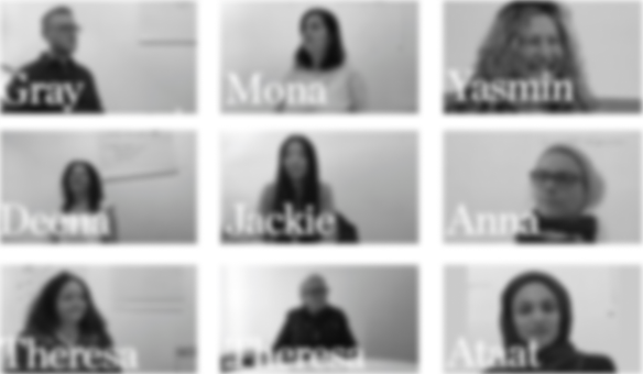
We took ideas that emerged from ideation sessions & tested high-level concepts with 9 customers in round 1 followed by 11 customers in round 2. To protect participants' privacy, their images have been blurred out. Here are some examples of assumptions my team and I set out to probe through our prototypes:
Building a personal preference profile has enough value for customers to consider registering an account on IGA.net.
Shoppers would take the time to build their shopping lists on the IGA app and website if the 'Shopping list' feature-set provides adequate incentives and functionalities built into it.
Customers find value in digital flyers if made more accessible and are offered alternative views.
Concept Refinement
Challenges and opportunities
Among insights gathered from the early interviews conducted during primary research, significant pain points had surfaced that we addressed via two rounds of testing. Following are some examples of how round one of testing offered opportunities for further refinement of concepts in round two.
Customers weren't sure if they could expect the same sense of control over product discovery and selection on the website, the way they could do in-store. We heard they had little incentive in signing up to create an account on IGA.net, let alone explore promotional content that wasn't aimed at their specific household. Following are some steps we took to address this challenge.
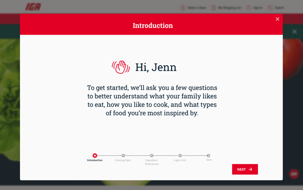
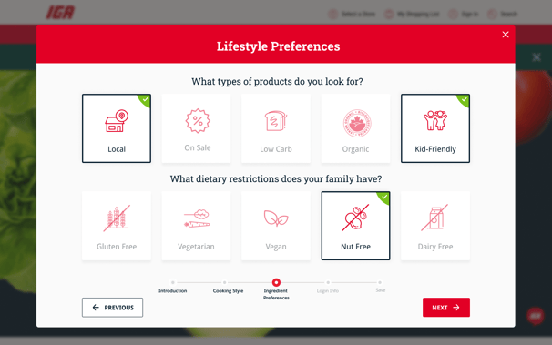
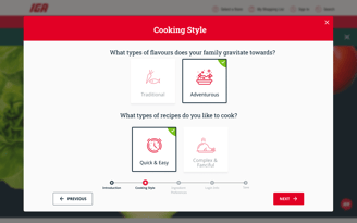
We designed a visually engaging onboarding questionnaire for customers to feel invested in building a household preference profile.
We created an editable preference dashboard to reflect all the choices such as dietary restrictions, picked by the users to help them feel a sense of ownership of the content they will experience on the platform.
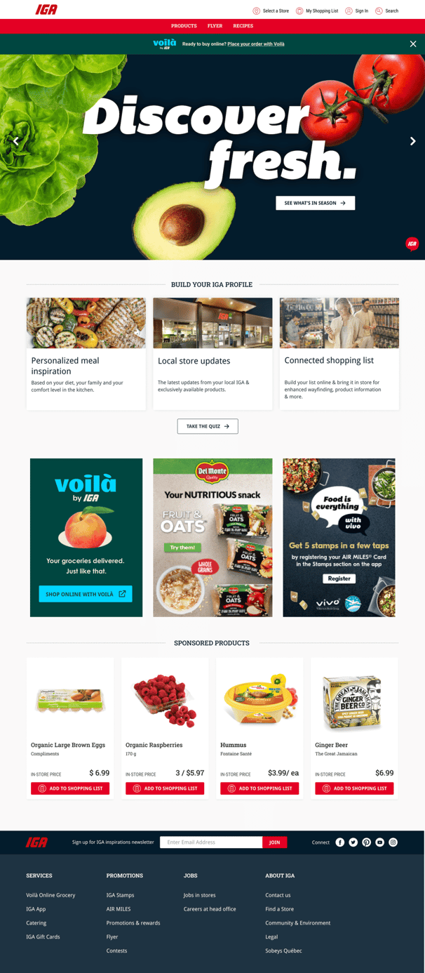
We enhanced the homepage to spark and facilitate the discovery of this feature through a quiz. We also added dynamic promotional content cards to test if users would be enticed to dig deeper.
Pain point -
Lack of control over product discovery online


1


3

2
Key Insight : Customers expect
a personalized product and offer curation
Customers found the personal preference selection questionnaire very promising and were generally enthusiastic about the implied level of control they could achieve over potential products and offers directed towards them. When we probed them to imagine the value they would expect to receive from signing up on IGA.net and creating a household profile, perks like personalized product categories and tailored deals were among the top expectations. Naturally, these answers were opportunities for us to prioritize and visualize for, in the next round of prototype testing.
Though customers trusted IGA in store for its quality products and sought to discover new items, this doesn’t currently translate online. This discovery tab felt a mishmash of other categories and stood out as being unintentional in its design, lacking personalization. To add to the chaos, the translation from print to digital felt clunky and outdated. Zooming and clicking functions weren’t intuitive and it was aesthetically unappealing. To address this challenge we made some changes:
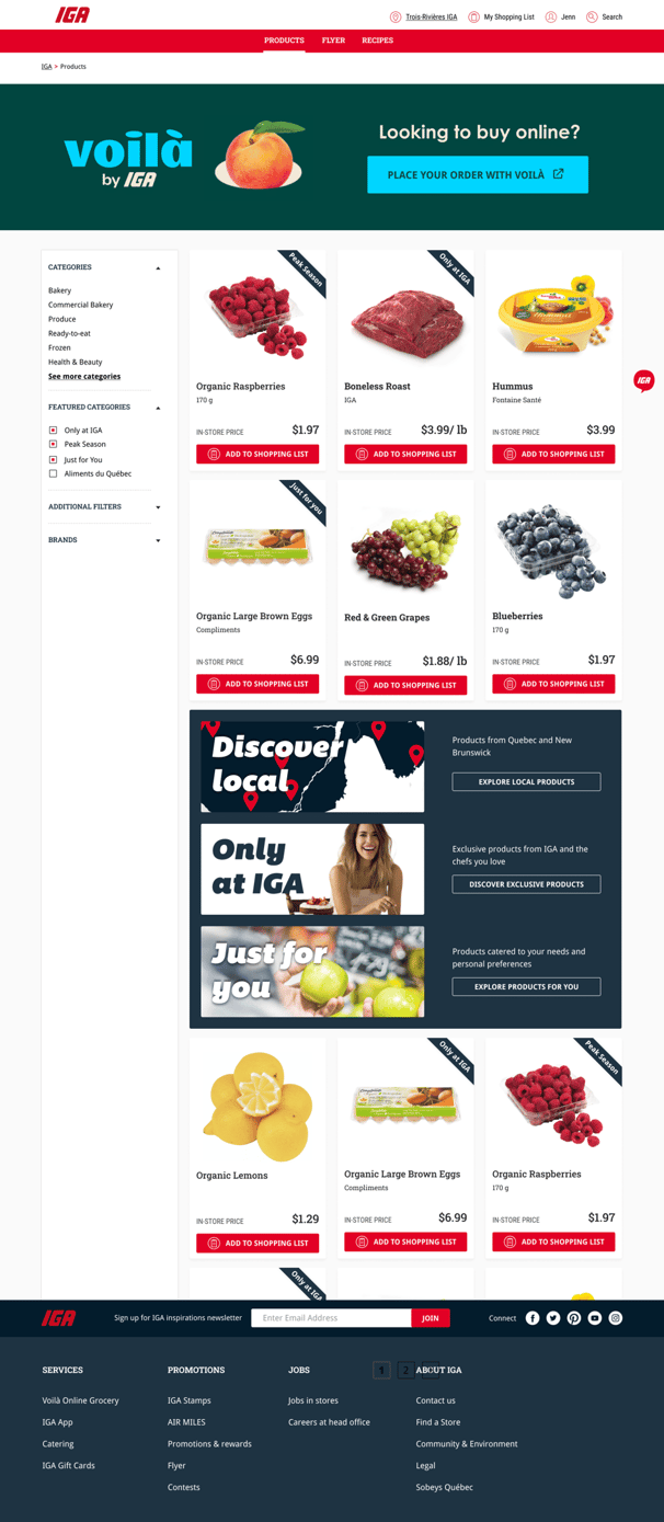
We experimented with an alternate product catalogue page layout that clearly lists out the different search filters customers have available to pick products that are most relevant to their needs.
We tagged select product tiles with ribbons specifying featured categories that are broadly useful to a vast majority of audience. Example tags are 'Only at IGA', 'Peak Season' and 'Just For You'.
We wanted to emphasise the introduction of these featured categories through broad banner sized cards to test if they would pique customers' curiosity to dig deeper.
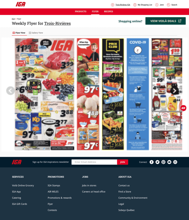
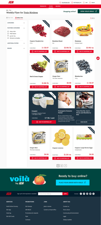
Additionally, we added a gallery view feature on the flyer page suggesting an alternate view for the traditional pdf view of digital flyer. We wanted to engage customers' imagination to inspire ideas beyond the rabbit hole of deals they were used to seeing on the flyer page.
Pain point -
Confusing Product Categories and clunky digital flyers

1
2
4
3
Key Insight : 'No' to traditional flyers &
'Yes' to sortable deal discovery
The idea of a gallery view of flyer deals was very well-received by a majority of test customers. Most customers expressed the need for a way to filter deals by popular brands, popular product categories (i.e. dairy, frozen) and basic price sorting. This was in addition to expecting to see how their household preference selections would impact the offers targeted towards them. A few of them also expected more education material around the source of produce they were picking and the local farms that they were contributing to. That made sense because IGA shoppers are typically interested in learning about how their purchases are impacting their local communities.

1
3
We took the above mentioned suggestions and created a gallery view of digital flyer to include these filters to offer an increased level of interaction with a feature that was traditionally a static piece of content. We made sure to retain the featured product category ribbons that were well received during the first round of testing.
Additionally we humanised the flyer gallery view with stories of local farmers and their products to inspire a sense of community while buying produce from small family businesses.
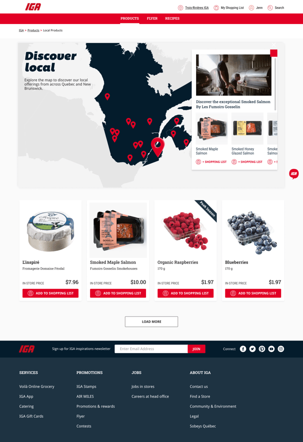
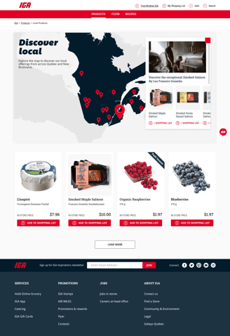
We also visualised a filtered view of product catalogue focused exclusively on local products to inspire a reaction from customers regarding ways of discovering new products. We included a map with location pins suggesting local offerings from across Quebec and New Brunswick.
A humanized product and deal discovery experience
2
Whether its using a notes app or writing it down with pen and paper, or having it memorized, people generally have set behaviour in terms of how best they create their own shopping list. Most participants were not using the existing shopping list feature on IGA.net because it was missing functionalities or integrations that would make list building useful. To address this we took a few different approaches to ideation:
Pain point -
Insufficient incentive for creating 'Shopping List' on IGA
1
2

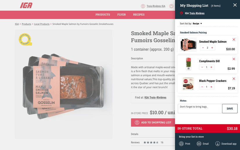
We presented customers with an enhanced 'Shopping list' view which included more information about their list than the website and app currently offered. As an example, we displayed way-finding information based on the items listed to save time while locating those items in store. The idea here was to use website and/or app as a way to bridge the virtual and in-person shopping experience.
Our concept indicated multiple sorting options for displaying products on the shopping list like 'Sort by Recipes'. Based on that, we asked customers broad questions around hypothetical functionalities like the ability to export recipe ingredients from a favourite recipe to their shopping list.
Key Insight : A thin line separates a shopping list from a cart
Customers were intrigued by the appeal of recipe pages potentially feeding into the shopping list, but mentioned needing more control over the choice of ingredients they could bring into their lists to avoid duplication. They were blown away by the idea of being able to locate their list items down to the 'Aisle number' to speed up their chores. In-store deal prices were automatically expected to apply to the list in addition to accurate in-store subtotal. Some participants also expected the option to link to an online checkout experience, at which point the shopping list begins to resemble a shopping cart. We, as a design team had to walk that thin line between prioritising user expectation and the business objective of offloading 'checkout' experience to their order fulfilment partner, Voila. Instead, we proposed a future roadmap feature of integrating the 'Checkout with Voila' button within the shopping list, that automatically exports select items on the list as a pre-built cart on Voila. However, for the upcoming release, we had to park that idea for the complexity of dependencies involved.


1
3
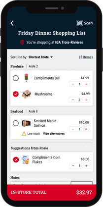
Based on the feedback we received for round 1 testing we revisited how recipe ingredients could be exported to the user's shopping list from a recipe detail page. An increased control over ingredient selection through checkboxes was built into the wires.
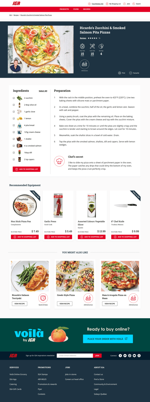
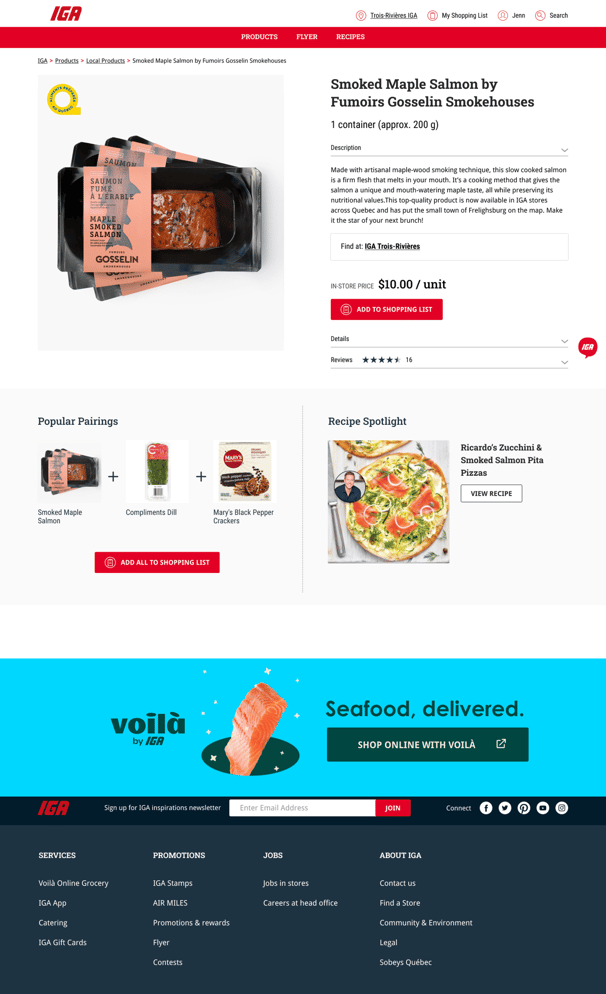
We visualized more ways of inspiring shopping list building such as adding a 'Popular pairing' and 'recipe spotlight' widgets to product detail page. These additions had the potential to aid in the organic process of new product discovery and addition to shopping list.
We had to deprioritise the feedback regarding a checkout and in-house delivery integration within the shopping list as the business directive was to highlight their order fulfilment partnership with Voila ( an online grocery home delivery service) instead.
Anchoring focus back to ease of list building
2
2

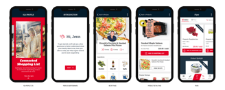
Adaptation of key prototype pages on mobile app
Next Steps
Ultimately, my team and I set out to validate all of our other assumptions around the features we wanted to learn more about. This groundwork of research, refinement and prioritisation helped us explore underlying drivers of customer behaviours and set us up for immense success in the next phase of design build and delivery.
The product team drafted the detailed user stories and requirements for the product specs outlined in the story map and clearly defined the upcoming release. We designed, built and released the MVP experience.
Experience it yourself
The feature-sets introduced through our research can all be found delivering value to shoppers on IGA.net

iga.net
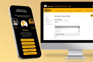
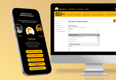
Interac
Sobeys + Scene Loyalty