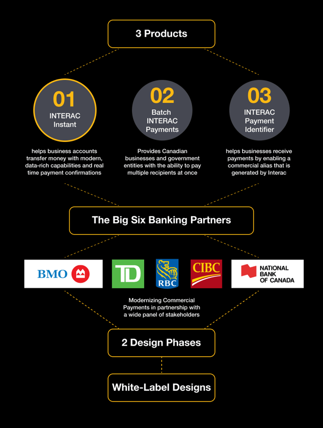
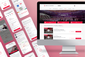
Interac Instant for commercial payments
Streamlining, standardizing and tracking online commercial payments in Canada. Socializing solutions through a white label experience
Overview
In 2020, Interac was on track to release a robust suite of solutions that were focused on enabling financial institutions to support Canadian businesses with near real-time electronic payment transfer capabilities. Interac was in the phase of creating guidelines for financial institutions on how to integrate these products into their respective platforms. At the time, these guidelines were just an exhaustive documentation of technical specifications and Q&As which were not enough for banks to visualize how these products would work in their branded platforms. That's where our product team at Deloitte stepped up to the plate.
The Business Challenge
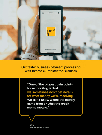
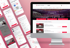
Interac Corporation was hoping to secure a stake in the commercial payments market within Canada with its product Interac Instant. Interac e-transfer was already being used by businesses to send and receive money under private accounts. However, they expected access to faster and more flexible payment options that supported sending remittance data to recipients and streamline paper-based accounting processes. Businesses needed a platform that can support sending documents like detailed invoices or purchase orders. As a leader in online transfers within the retail payments market in Canada, Interac wanted to leverage its pre-existing footprint to provide that very solution to the commercial segment with modifications and additions to ensure interoperability amongst Financial Institutions (FIs). Ultimately, Interac Instant was devised to provide all parties with real-time payment confirmations with added security through email or text message verification.

How might we help Interac effectively socialize complex commercial offerings with their banking partners through a white labelled banking experience?
The design objective
Interac needed a functional yet visually engaging way to socialize their new solutions with their banking partners and demonstrate how their products should be implemented in their commercial offerings. That translated into our creative brief of prototyping a white-labelled online banking payment experience that integrates three of Interac's newest solutions, among which Interac Instant was the largest and the most complex to unravel. Simply put, our job was to help Interac help their clients by designing a prototype that supports many commercial payment use cases.
My Role
I was a Lead UX designer working closely with a senior product manager and a functional lead on this project. I was also the sole designer on the project leading the ideation, documentation and client presentations.
Project Setup
The project had been set up to pan out in two phases. My team and I inherited the design work done in the first phase and were in charge of addressing the ensuing stakeholder feedback (both Interac's & Banks') and incorporating refinements or overhauls, as needed in the second phase. Work done in the first phase was a design discovery followed by a fully clickable prototype of Interac Instant which surfaced some outstanding challenges to be addressed. I have illustrated a select few of these challenges in the sections below.

Challenge 1
A Fully clickable prototype
is not a golden pill.
Coming out of design phase 1, was a fully clickable prototype that was shared out to some of the top Canadian financial institutions ( CIBC, Scotiabank, BMO, RBC, TD & National Bank) without someone from business lending a voiceover to product demos. As expected, viewers of the prototype were getting lost, without the moderation. When we learnt about that, we changed gears to adapt our prototype's overall structure to Interac's objective of being able to socialize the product with stakeholders at top banks over simple channels like emails.
For phase 2, we focused on finding a way to document alternate routes and state changes, without derailing the main user flows. We presented a scenario based alternative to the client &demonstrated how combining all use cases to mimic the real experience via a fully clickable product prototype is not always the gold standard of practices.
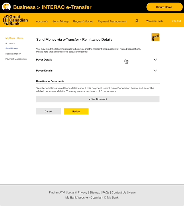
We addressed this confusion with a conversational design of central dashboard of links to alternate flows that linked right back to the the dashboard from all the screens in the flows.
As illustrated in this example, we assigned an additional header space above all the pages in our prototype with CTAs leading back to the dashboard of alternate flows as well as alternate states of the current screen view.
Mitigation
Lesson
In summary we learnt that fully-clickable prototypes are great for usability tests, but not as self-explanatory end deliverables. It is therefore a lesson in fully understanding the intended journey of a prototype or any design deliverable for that matter and knowing which specific business scenerios are we designing to serve.


1
2
3
Challenge 2
Stress-testing already established ideas
Fore phase 2, there was an expectation to build on user flows already established in the previous phase even-though we had discovered numerous usability issues that were not serving the end users' objectives customers' goals any more. It is natural for businesses to be uncomfortable with the idea of second-guessing key decisions and sometimes retiring ideas pursued resolutely in previous phases in the interest of going to market as soon as possible. But we persisted in our efforts to gently anchor our stakeholders' attention back to their long-term goals with the product and make room for meaningful overhauls, when needed.
Example 1 - Transaction Type Selection
An example of a fundamental issue we faced with the demo was that an end user must decide what type of transaction was needed to send funds with, at the very beginning of the money-transfering flow: Interac e- Transfer or Interac Instant.
When we guerilla tested this flow, we uncovered confusion regarding the product terminology as it wasn't intuitive or comprehensive despite the accompanying helper text. Testers that were accustomed to using Interac e-transfer to send funds weren't sure how Interac Instant was different from it.
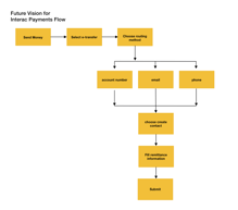
The initial requirement for having users select the transaction type right off the start was to surface the appropriate form fields on the next screen that changed based on the option picked. This approach however didn't take into account the long-term business vision to brand both the products under a single e-transfer umbrella where users would be able to send funds through a number of routing methods: Account Number, Email, SMS, Contact Identifier, Payment Identifier, etc, upfront This will in turn determine the “transaction type” automatically.
Instead of rolling this vision out in future all at once, we decided to mitigate the expected confusion by unifying the E-transfer and Instant flows in a way that primes users for future vision. With the transitional design and refined flow, we allowed users to be able to select an existing recipient contact first or create a new one and then have them select the preferable money sending method.
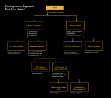
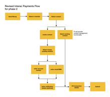
Existing vs Revised flows for Interac payments
Please click into each tile for an enlarged view
2
3
1
3
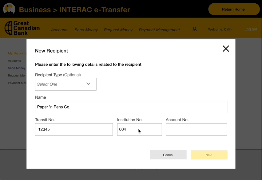
Example 2 - Recipient Creation
We noticed a similar issue with the recipient creation flow where a sender of funds needed to pick a customer type for adding a new recipient on their account. There was no straightforward answer for why or how the sender would know this information. We learnt that the Recipient Type was added to demonstrate that the form could change if it was an individual (first name and last name fields) or a business (business name field) that was being added as a new contact. On further analysis, there were no dependencies that could be triggered if this data point is hidden except for the remittance data being saved against a recipient.
Therefore, by condensing the e-Transfer and Instant Flows, we had the opportunity to make 'Recipient Type' optional in the recipient creation screens.
We also decided against showing 'Recipient Type' as a data point in the transaction review screen for as this would only be useful for the purposes of viewing an organised list of saved contacts in one's account.
In a future state the sender would ideally be prompted to choose the method for payment (Send via ANR, or SMS, or Email) first. The current order of questions would be flipped. The payment routing step would be followed by optional steps like saving recipient details against new or existing contacts.
Mitigation
Ultimately, we modified the overall task flows that we had inherited from the first phase to incorporate white label product best practices. We resolved usability issues and replaced design patterns that were not in coherence with the branded environments of financial institutions . In order for to successfully rebrand Interac’s product, it was important to create a site that looked like every bank, and yet like no specific bank.
Lesson
Good white labelled products save resellers time and guesswork around UX best practices. Businesses (banks in this case) often have to take on the responsibility for any issues consumers experience while launching rebranded white label products and it was important for Interac to be a trusted long-term partner in that regard.
1
2
Challenge 3
Information Overload & Content Redundancy
A quick revision of the Instant screen flow from the first design phase made us realize that there were numerous form fields to be completed for sending funds from person A to B. Originally, we were told that all of the fields were mandatory. However, we wanted to enquire about their relevance and collect any thoughts on allowing for a template creation workflow or a way of storing this information for when the sender has another payment to be made to the same recipient. There were potential flows to be explored where either the information is requested when the contact is created or is retained after the first payment is made. Upon further enquiry, we knew there was room for reducing the page content or show progressive data entry.
A few questions that we asked the business were:
Do we want to consider allowing users to select which fields to complete? Or to recommend which should be filled out? (i.e., hiding some fields until the user expands the said section) We explored a flow where none of these details are mandatory to collect. We were able to refine the view to reduce the overall overwhelm from the initial designs.
Another screen prioritized for filtering only the most data points were the transaction history page. In the example alongside , both the recipient and sender’s account is visible when clicked for additional transaction details. The question we asked the business was whether the sender even needs to see their own details like account number and business name in his outgoing transactions. Also, are there any alternative data that we would look to include here? In this instance, we learnt that the sender and the invoicer could be different when operating from a business account. That explained why the sender's information on their own transaction history view was not redundant, even if it was repetitive.
Mitigation
1
2
Together with our functional team who sourced sourced weekly clarifications from the stakeholders, I was able to speed up the design approval process by condensing all our content related queries in a centralised live document that could be accessed by the clients' product team at any time. This approach gave us confidence in our overall design direction.
Lesson
Content audits and data relevancy checks are well worth the effort when businesses pursue simplicity of function in their end products. Every additional irrelanvant step in a task could mean discontent for end users and ultimately negate product adoption.
Takeaways & Impact
Ultimately, we enhanced the white label prototype with UX best practices and introduced new & improved design patterns in the Design phase 2. We had access to both technical inputs and client feedback from Design phase 1 that exponentially improved the overall product experience in the 2nd phase. We also learnt that despite all the UX handholding packed within our white label prototype, financial institutions must work with their commercial customers to overcome the barriers of electronic payment adoption through their own branded experiences simultaneously.
This ideation phase was particularly freeing in a way that we didn’t have to pixel peep into UI perfection just yet. We were focused on optimizing the total number of clicks & creating a minimal design library that was easy to expand upon when more complex requirements were sent our way.
When we we finally released our elevated white label prototype for circulation among the top banking product teams, we received a rewardingly positive response and our overall strategy of a centralised dashboard housing all the prioritised use cases were found self explanatory and comprehensive.
In the August of 2021, Interac went on to introduce instant digital payments for businesses to the public markets by enabling 14 major Canadian banks to offer this functionality to their customers with 23 more to join the roster in the following months. Despite the challenges of COVID-19, there was massive pressure across all industries and businesses to digitize their operations and minimize their cost of capital by eliminating the manual cheque preparation, signing, mailing, reconciliation process. By the end of the year 2023, the use of Interac e-Transfer for Business among businesses had successfully climbed with Statistics Canada recently noting that over half of businesses (50.0%) now accept it as a method of payment. I feel honoured to have been a small and exciting part of Interac's story of driving new digital payment innovations into the future.
Read all about Interac's media launch of instant commercial payment solutions in the articles below


Explore Interac E-transfer for Business and
all associated features here
Experience it yourself
interac.ca
Canadian Olypmic Committee
IGA